Synthetic Monitoring

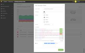
Simulate visitor interaction with your site to monitor the end user experience.

View Product Info

FEATURES

Simulate visitor interaction

Identify bottlenecks and speed up your website.

Learn More

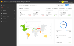
Real User Monitoring

Enhance your site performance with data from actual site visitors

View Product Info

FEATURES

Real user insights in real time

Know how your site or web app is performing with real user insights

Learn More

Infrastructure Monitoring Powered by SolarWinds AppOptics

Instant visibility into servers, virtual hosts, and containerized environments

View Infrastructure Monitoring Info
Comprehensive set of turnkey infrastructure integrations
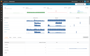
Including dozens of AWS and Azure services, container orchestrations like Docker and Kubernetes, and more 

Learn More

Application Performance Monitoring Powered by SolarWinds AppOptics

Comprehensive, full-stack visibility, and troubleshooting

View Application Performance Monitoring Info
Complete visibility into application issues
Pinpoint the root cause down to a poor-performing line of code

Learn More

Log Management and Analytics Powered by SolarWinds Loggly

Integrated, cost-effective, hosted, and scalable full-stack, multi-source log management

 View Log Management and Analytics Info
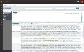
Collect, search, and analyze log data

Quickly jump into the relevant logs to accelerate troubleshooting

Learn More

Awesome visualizations of internet and web tech

VisualizationText and numbers are all good and well, but sometimes it’s nice to just be presented with a nice visual.

This post is full of videos of just that, interesting visualizations of data. Being the geeks we are, they’re of course all related to the Web and the Internet.

Enjoy!

The work done by a web server

Someone put this great video together using the website access log visualizer Logstalgia. You can see visitors to the left and the server to the right.

More website traffic

Once again, a high-traffic website access log visualization, this time using another tool, Gource (which we’ll show more from later).

Website traffic… bubbles?

Interesting website access log visualization using glTail. Each circle is an HTTP request, and the size of the circle shows the size of the request.

24 hours of traffic to the New York Times website

A pretty cool visualization, mapping the location of the site’s visitors as the hours change.

Web traffic meets genetics

Here’s another interesting visualization, creating an “organism” based on the access pattern to a website. Doubly geeky, then…

11 seconds of Twitter

A brief look at Twitter’s firehose anno 2009.

Tag clouds on Twitter

One more Twitter visualization, this time showing tag clouds bubbling up in realtime.

Location, location, location!

Location streams from Foursquare, Gowalla, Twitter, etc, during SXSW in Austin, Texas this year. Created using Processing and OpenStreetMap.

The global activity on Facebook

While we’re on the subject of social networks, why not have look at the activity on Facebook? This is a pretty interesting visualization, showing different kinds of Facebook activities mapped onto a model of the planet.

The development history of Apache

Apache is the most widely-used web server on the Internet. This is a visualization of its development history using a tool called Code Swarm.

The development history of Linux

Another fundamental part of the Web today is Linux, highly popular in web servers. Here’s the code swarm showing it’s development from the start (1991) until 2008. Note the vast difference in activity over time. At the start, there’s just Linus Torvalds, but just look at the activity during the later part of the video.

Linux, the last 5 years

Because it’s just plain pretty, we couldn’t help but include one more visualization of the Linux kernel development, this time using Gource.

The development history of various open source projects

We’ve already mentioned Gource (which is, as we’re sure you’ve figured out, a software version control visualization tool). Here’s another cool video showing projects like Drupal, Ruby on Rails, PostgreSQL, etc.

DNS… stuff…

Not entirely sure what’s being shown here other than that it’s DNS-related. Again, using glTail.

A network with 300 peers

Another visualization tool strutting its stuff, this time SkyRails, showing activity in a network with 300 nodes.

How the Internet has grown

As a relaxing ending to this little collection, we thought it would be nice with a visualization of what’s making most of this possible: the Internet. This is a slideshow, but it’s worth looking through.

We hope you enjoyed these videos. And for those of you in the United States, happy Thanksgiving!

SolarWinds Observability now offers synthetic transaction monitoring

Powerful transaction monitoring now complements the availability and real user [...]

Exit Rate vs Bounce Rate – Which One You Should Improve and Why

Tracking your website’s exit and bounce rates will give you insight into how [...]

Introduction to Observability

These days, systems and applications evolve at a rapid pace. This makes analyzi [...]

Webpages Are Getting Larger Every Year, and Here’s Why it Matters

Last updated: February 29, 2024 Average size of a webpage matters because it [...]

A Beginner’s Guide to Using CDNs

Last updated: February 28, 2024 Websites have become larger and more complex [...]

Monitor your website’s uptime and performance

With Pingdom's website monitoring you are always the first to know when your site is in trouble, and as a result you are making the Internet faster and more reliable. Nice, huh?

START YOUR FREE 30-DAY TRIAL

MONITOR YOUR WEB APPLICATION PERFORMANCE

Gain availability and performance insights with Pingdom – a comprehensive web application performance and digital experience monitoring tool.

START YOUR FREE 30-DAY TRIAL
Start monitoring for free