

Display resolutions are increasing every year, something that’s being taken to its extreme with the recent “retina display” trend that came with the latest iPad. The jump in onscreen pixels is massive, and such displays are soon bound to make their way into regular laptops and desktop displays, perhaps as soon as this year.
This development will have a profound effect on the size of the graphics resources necessary for websites, which ultimately will make websites bigger, more bloated and slower to download. That is, if we don’t change tactics.
The growing footprint of bitmap graphics
High-resolution monitors place increasing demands on the resolution of our graphics resources. For example, most of today’s monitors of good quality have around 110-130 PPI (pixels per inch). A retina display like that on the new iPad has around 300 PPI.
A square image with a side of 5 inches on a 130 PPI screen is 650×650 pixels. On a 300 PPI screen an image with the same dimensions would be have to be 1500×1500 pixels.
So, going from 130 to 300 PPI, the same 5-inch square image goes from containing 422,500 pixels to containing 2,250,000 pixels. That’s more than 5 times as many.
In other words, serving increasingly large images with bitmap graphics formats like JPG and PNG is becoming impractical, or at least inefficient.
All web page resources are growing in size year over year, but images account for such a large part of the average web page size that they have a bigger impact than for example CSS or HTML files. Keeping their size in check is very important.
Enter SVG and resolution independence
Modern browsers support SVG, a scalable vector graphics format (a cookie if you guess what the acronym stands for…). You’ve most likely heard of it, maybe even played around with it. SVG is standardized and has been around for years, but isn’t used much in web design today, most likely due to the poor browser support it used to have.
The benefit of vector graphics is that it’s resolution-independent and has a small memory footprint. The same image data can be rendered to a low resolution or a super-high resolution, it can scale indefinitely without any loss in quality.
Not all graphics resources are suitable for vector formats, of course. Photos are poor candidates for SVG. However, a lot of the graphics on the Web is made up of illustrations and icons, which are perfect for vector graphics.
Use of vector graphics future-proofs those resources, at least in terms of supported display resolutions. Check out the Emacs for Mac OS X site, for example, which totals in at a mere 21 kB, all resources included, and is scalable to any resolution (open it, resize the browser window to see it in effect).
Also, since SVG is a text-based markup language (XML-based), it compresses nicely with standard gzip, making the transfer size even smaller when people load your website.
Is browser support good enough?
Browsers with basic SVG support include Internet Explorer 9 and later, Firefox 4 and later, Chrome 4 and later, Safari 4 and later, Opera 9.5 and later. These account for around 80% of the web browsers in use today according to StatCounter data for May.
Check out CanIUse.com for more details on SVG feature support in different browsers.
Remember, you can always have a fallback option, a version of the site that uses pre-rendered JPG and/or PNG images if you detect that the browser doesn’t have SVG support. And no one says you need to use SVG for everything.
The tools are already there
It’s not like designers are handicapped when it comes to creating SVG content. The vector graphics tool chain is already in place, thanks to applications like Adobe Illustrator. There are even free, open source options, such as Inkscape.
Most logos and many icons are already designed with vector graphics, and it’s common in print. The translation to Web should be relatively straightforward. Famous last words, we know, but people are already proving it can be done, and done with style.
Conclusion
In short, web designers could use SVG to a much larger extent than they do today. It may not be suitable for all kinds of content, but there are plenty of websites that would benefit from it.
The win is a smaller memory footprint (faster download), and resolution independence. This will become increasingly important as more high-resolution monitors come into the market.
Wouldn’t it be nice to have a website where all graphics automatically matches the screen resolution perfectly, and not have to worry that your site looks like a pixelated mess on that new iPad retina display?
What now?
If you want to dive right in and explore the world of SVG for web design, A List Apart has an excellent primer by Shelley Powers (don’t miss that there’s a part 2). You might also want to check out this introductory article by David Bushell over at Smashing Magazine. You can also head over to W3Schools for an introduction.
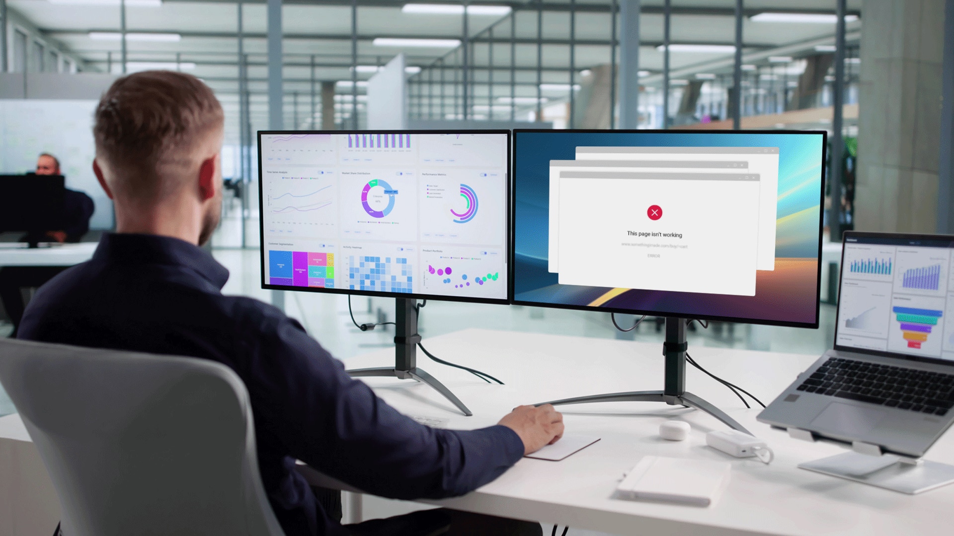
Image credit: Top image via Shutterstock.


