
 Web design carries with it certain challenges that don’t exist in print design. Perhaps the most obvious is that in print design, whether you print your own work or have it printed by a professional, you know what your work is going to look like before your customer sees it.
Web designers don’t have this luxury. There’s always the chance that something, or maybe many things, won’t look or behave the same from browser to browser and from operating system to operating system. It’s easy to make mistakes that can make your website appear strange or annoying to a lot of website visitors.
In this article I’ll take a look at what I feel are some of the more common mistakes that web designers make, and how to avoid them.
Resolution mistakes
Design mistakes related to screen resolution limitations are quite common. Those of us who work with computers on a daily basis, and particularly those of us who design graphics, tend to have the newest, largest displays. It’s easy to forget that the typical website user will likely have a smaller, lower-quality display.
For example, Apple’s new 27” iMac has a display resolution of 2560 by 1440 pixels. However, according to W3Counter.com, which tracks website and browser statistics, the typical display in September of 2009 is only 1024 by 768 pixels. If you were to design your site for a width of 2560 pixels, only 1024 of those pixels would appear on a typical monitor. Seeing the rest of the website would require scrolling from left to right while viewing the site, which is hardly practical for most users. (This was an extreme example, but you get my point.)
If you were to instead design for a width of 1024 pixels, users on a 2560 pixel display would still be able to view your site, they would just get extra white space on one or both sides. The extra white space is a far more acceptable solution than requiring readers to scroll their browser from left to right.

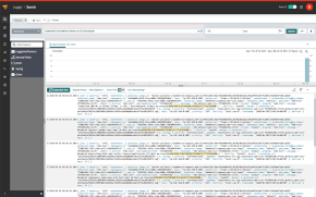
Above: Royal Pingdom’s 1024 resolution website, as viewed on my iMac.
Sound mistakes
Creating a website with auto-loading sound, such as background music, is probably the quickest way there is to get your viewers to click the back button.
Not many of us share the same taste in music even with our families, let alone the strangers who will visit our websites. Expecting visitors to enjoy your taste in music is usually too much to ask. Even verbal announcements can be annoying, particularly if they’re unexpected. For these reasons, it’s a good idea to make any audio on your website an option activated by a user clicking a hyperlink.
Graphics mistakes
Even if you’re using the most recent (and most expensive) version of Photoshop, bad graphic design and image handling can still impact your website in a number of ways:
Compression mistakes
A mistake I often see is improperly compressed graphics. Most high color images, such as photos, don’t have to be compressed using your graphics editor’s best compression settings. In particular, using Photoshop can be an issue here, since its best JPG setting automatically turns off a compression technique called “subsampling”. The subsampling process can usually save quite a bit of file space in an image, without any loss of image quality.
An exception to this rule is images containing sharp edges, such as text or lines. These images can develop artifacts from subsampling. Adobe considers the issue of when subsampling is turned on or off to be a trade secret, the only way to ensure that it’s turned off in Photoshop is to use the best JPG compression setting. Some other image editors, such as Ulead PhotoImpact, use separate subsampling and quality controls, so that the issue isn’t forced upon users.
Image dimension mistakes
Another common mistake is the use of excessively large images. No one really wants to sit in front of a computer waiting for an image to load. Using your graphics editor’s slicing feature can help you break a large image into several smaller images. Although the load time is still about the same, the chain of small images loading into your browser occupies your viewer’s attention, making the site appear to load faster.
GIF vs. PNG
The GIF versus PNG issue is still a concern for some web designers, but I feel that PNG is finally supported across enough browsers to make it the better choice for low color images (such as buttons and bullets).
If you’re still more comfortable with GIF, make sure to design your GIFs on the same color background as your website. This will avoid the appearance of rough edges in your image, caused by the GIF format not having the ability to gradually blend your image into your web page background. Also, although most graphics editors still support “Web Safe” colors for GIFs and PNGs, this option should be avoided entirely. According to W3Schools.com, only 1% of web users were still using “Web Safe” (256 color) displays as of January, 2009.
The 10% Rule
This all leads to a question that’s sparked a great deal of debate among web designers: Since you can’t design for 100% of the public, who do you leave out? For example, should you still use Web Safe colors so that 100% of your potential viewers will have color compatibility? No, since the other 99% will see poor color quality.
Personally, I use what I call “The 10% Rule”. If 10% or less of my potential viewers will be impacted by a given decision, such as using 1024 by 768 resolution, or not using Web Safe colors, I consider this acceptable. Granted, that’s just one blogger’s opinion on where to “draw the line”, and it depends on what kind of website you’re offering, but stating opinions is one of the purposes of blogging.
Do you have any pet peeves regarding web design that you would like to add?
About the author:
Anthony Celeste is a technical writer, multimedia developer, and Windows programmer. Anthony wrote about color theory and Web design in “Corel DRAW 10: The Official Guide”, and covered animation and special effects in “Ulead PhotoImpact 7: The Official Guide”.


